
Caution: before moving the Illustrator file to a different machine, be sure to copy all the font used and put them on the new machine (fonts folder in the system folder ).
Note: Although I used Windows throughout this process, the process on a Mac is pretty dang similar.
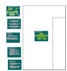
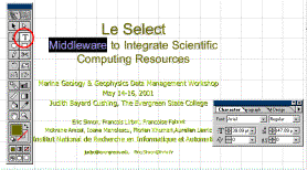
I was asked to create a poster from a powerpoint presentation. There were six slides be presented. Layout was on an additional slide.
|
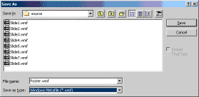
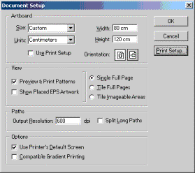
The customer specified that the poster was to be 120 cm by 80 cm in portrait orientation. The first thing I did was save each slide as a Windows Metafiles (.wmf) from inside PowerPoint |
|
|
. Then, in Adobe Illustrator, I created a new document and selected Document Setup from the File menu. Here I specified the size and orientation. |
|
|
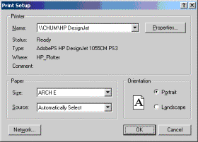
I specified the printer (I had to set it up first from the Windows Printer Control Panel – not shown) |
|
|
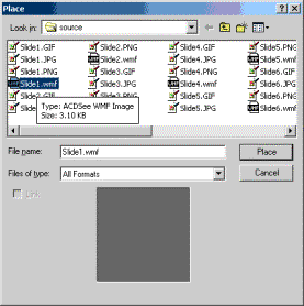
I placed (File | Place) all the slides into the Illustrator document. |
|
|
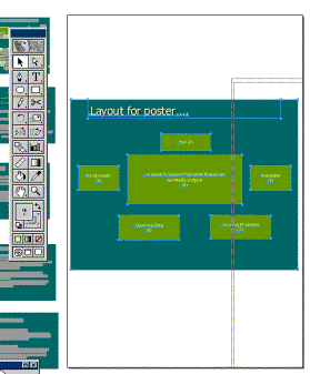
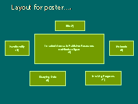
The layout slide went inside the artboard (Figure 2), all the others I placed outside of it. |
|
|
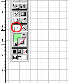
The WMF format is vector based and retains all the shapes and text as distinct objects. Resizing is them is easy and they look good no matter how much bigger or smaller they are from the originals. I made sure to drag the marque around each of the slides and group them individually. (Ctrl-G or Object | Group from the menu). The next step was to resize the layout. I selected the resize tool from the tool box (Figure 1). Next, holding down the shift key to constrain the proportions of the object, I did a click and drag operation on the layout slide to size it up to the layout board. |
|
|
At this point it becomes obvious that the layout is going to have to be revised. No problem Ungroup (select compound object, Ctrl-Shift-G) and then move the boxes around until things make more sense. Since the middle slide is the most important (and most attractive), I sized it to dominate the poster. |
|
|
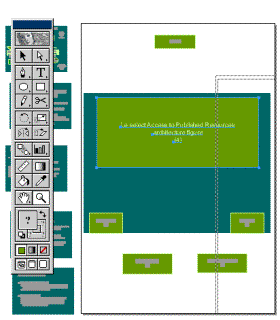
Now we move the individual slides to their places and delete all the elements of the layout slide. I also turned on the grid (View | Show Grid or Ctrl +) so I could really line stuff up. I also moved in some guides (green dashed horizontal and vertical lines dragged from the ruler), and put in a temporary X so I could find the exact center of the artboard. Note the colors selected – no fill and black for the stroke Solid backgrounds are nice for online presentations, but posters should have lots of white space. I removed all the teal boxes. |
|
|
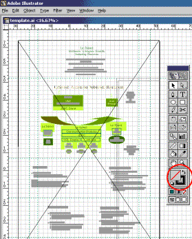
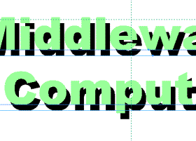
The text is too light without a background! That’s OK, we’ll steal colors from the middle slide using the teardrop color selector. I had to change the font as well – Outline font doesn’t work. The font tool is under Type | Character, the Paragraph tool under Type will be useful to us also. With the text tool selected, the cursor becomes an I beam and you can select text as text and not as an object (object select applied to text appears as a blue line under the selected text object). If you’re comfortable with point sizing text, you can select the text (either as object or as text) and change its size in the Character toolbox. If not, you can always use the Resize tool on text objects. |
|
|
Judy also wanted to change the title text. The wmf export made seemingly random choices about whether to identify single words or combinations of words as objects. I found it more convenient concatentate the titlebar type elements so I could apply paragraph justification operations (center) on the whole title at one time. This nifty shadowed text effect was created by the following technique: · Select the text · Copy & paste (Ctrl-C, Ctrl-V) · Send object to back (Object | Arrange | Send to back or Ctrl-Shift-[ ) · Change fill color to black, stroke color to none · Position black copy of text slightly offset original |
|
|
Place and position graphical elements – in this case I had to put various logos – herein was a problem. All I had was jpegs and gifs. Both are raster graphics and absolutely do not scale gracefully. |
|
|
The next step was to create a proof in Adobe Acrobat. First I had to shrink the image down to letter size. Select All, Open a new Ilustrator document, set it’s page characteristics to Letter size, Paste in and size down the poster. Then File | Save As… PDF. After Previewing the PDF in Acrobat, send to the customer. |
|
|
After all the revisions were complete, it was time to go for a final print. Change the hand to the print area tool and put your Arch E Print area borders outside of the image area. That’s it, print it. |
|